This site uses cookies to improve your experience. To help us insure we adhere to various privacy regulations, please select your country/region of residence. If you do not select a country, we will assume you are from the United States. Select your Cookie Settings or view our Privacy Policy and Terms of Use.
Cookie Settings
Cookies and similar technologies are used on this website for proper function of the website, for tracking performance analytics and for marketing purposes. We and some of our third-party providers may use cookie data for various purposes. Please review the cookie settings below and choose your preference.
Used for the proper function of the website
Used for monitoring website traffic and interactions
Cookie Settings
Cookies and similar technologies are used on this website for proper function of the website, for tracking performance analytics and for marketing purposes. We and some of our third-party providers may use cookie data for various purposes. Please review the cookie settings below and choose your preference.
Strictly Necessary: Used for the proper function of the website
Performance/Analytics: Used for monitoring website traffic and interactions
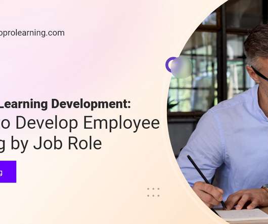
Table 2 below provides estimates of the format and amount of content corresponding to the course length. Pages Of Content – Assuming pages are letter-sized, double-spaced, single-sided. . Figure 2 – The Elearning Course Development Process Used By Spark + Co. Table 2 – Roles When Developing Elearning Courses.
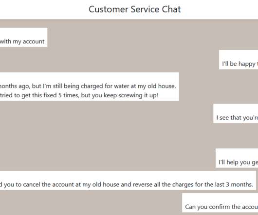
I built the sample below in a little less than 2 hours, almost all of which was actually writing the conversation and choices. That page includes instructions for installing and using the format. The post How I Built a Chat Simulation in 2 Hours appeared first on Experiencing eLearning. Trialogue format.
How should you structure it, and what pages do you need? For them, creating a new page and adding their courses to it is a fairly straightforward process. There’s a lot your website should be doing for you beyond offering sales pages for your courses. Write an about page to introduce learners to your background and expertise.
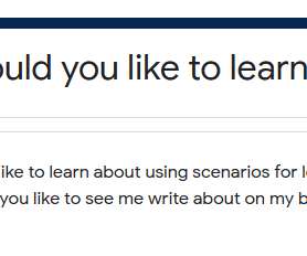
I’d like your help answering a 2-question survey about what you’d like to learn about scenarios for learning. If you’re looking for more reading, check out my Storytelling and Scenarios page with links to over 50 posts. Many of my most popular blog posts have been prompted by questions from readers. Thank you!
2) Will it allow for continuous feedback that feels organic and seamless? 3) Does it help get everyone on the same page, so that we’re all working toward agreed-upon, strategic outcomes? Download Paycor’s guide to learn more.
In season 2 of her podcast, Joanie is highlighting a series of interviews about AI and how it affects our field. Check those pages for links to resources mentioned in our conversation. I recently had the pleasure of speaking with Joanie Musser about AI in learning and development for the Mindset to Learn podcast.
The student teachers were randomly assigned to one of three experimental conditions:control group (online scenario-based learning activity), intervention group 1 (online scenario-based learning activity and feedback), and intervention group 2 (online scenario-based learning, feedback, and reflection). SBL summary. Scenario-based learning.
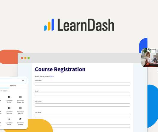
For example the course registration page for LearnDash is simple enough to allow your learners to register for your course quickly. By going this route, you’re able to streamline sales through a one-page checkout experience and include upsells and order bumps to help increase sales. Automation made simple. WooCommerce Instagram.
Researching options, getting stakeholders on the same page, and reviewing vendor proposals all take time, so its important to plan for a sufficient timeline, especially if you opt for a customized platform. With an LMS, learners can access courses anytime, track their progress, and stay engaged with their training.
2) Will it allow for continuous feedback that feels organic and seamless? 3) Does it help get everyone on the same page, so that we’re all working toward agreed-upon, strategic outcomes? Download Paycor’s guide to learn more.
It’ll also automatically configure groups if you want to use them along with creating the required registration and registration success pages. Step 2: Build your challenge exam in the WordPress block editor. The new blocks allow you to customize the LearnDash login page, profile page, course list, and more!
Organizations with a comprehensive onboarding process also experience up to 50% more new hire productivity than those that do not (2). Resource materials can come in many different formats including an employee handbook, a website, an intranet page or in training videos. Set clear expectations. Final Note.
Pros: Easy drag-and-drop builder Mobile responsive forms Pre-built form templates Cons: Limited advanced features in the free version Lacks payment integrations without premium upgrade 2. Elementor (Page Builder for Custom Course Layouts) Installs: 10M+ Rating: 4.6/5 5 Use Case: Manage and cloak affiliate links for monetization.
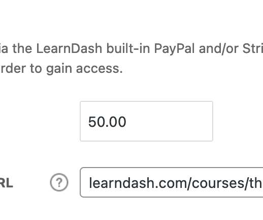
With MemberDash, you can create a WordPress membership site in just a few steps: Step 1: Purchase and install MemberDash Step 2: Create your first membership Step 3: Configure payment settings Step 4: Restrict your content Let’s take a closer look. MemberDash allows you to restrict pages, posts, or custom post types.
Knowing what you need from an eLearning authoring tool can be hard, especially when there are so many options on the market. gomo’s new ebook aims to save you time and hassle by identifying 12 must-have authoring tool features.
This is post #2 in a series about the instructional design. Even writing one-page handouts helps you gain experience and gives you something to talk about in an interview (and maybe show in a portfolio). Originally published 5/27/2007, last updated 2/4/2019. Read the first post, What does an instructional designer do? ,
2) How many users can be on my course at one time? Slow site performance contributes to a higher exit rate, lower page views, and decreased user satisfaction. Course pages are too long. If you have an exceptionally long course page, it can also lead to load problems. How many users can LearnDash handle? Dedicated Server.
Regular training provides your business with an opportunity to make sure customer service teams are all on the same page and are equipped with the most accurate information. In fact, a Gartner study found that more than two-thirds of companies compete primarily on the basis of customer experiences (2).
How much content belongs on each page? You want to add more videos, include every detail of information that comes to mind, and cram the page full of interactive features. Next thing you know, the page is a mile long and learners are struggling to complete lessons. It makes for an unappealing layout on your course page.
If you’re serious about turning more site visitors into members, then it’s time to get focused on your membership sales page. A membership sales page is a landing page that’s focused on converting prospects into members. But what do you need to do to build a sales landing page that will make a real difference in your business?
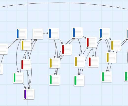
If each choice has 3 options, you end up with 9 slides after just 2 choices, and 27 after 3 choices. For example, I built a chat simulation with 50 passages in only 2 hours. If they make 2 or 3 errors in a row, they get to an ending and have to restart the whole thing. It ends after 2 choices instead of 3.
This is also a great opportunity to have employees recall previous information that relates to the new, upcoming information or tool, as a basis for getting everyone on the same page. Use mLearning as a means for continuous engagement in knowledge development.
Online courses aren’t just about the words written on the page or the images on the screen, but about how those words and images work together to convey ideas. When we read a book, we start on the first page and read through the pages in sequence until we reach the end. Organize content so that it can be scanned in an E.
Your course landing page is your opportunity to showcase the value of your course and convince potential students to take the next step and enroll. If you can direct your audience to a course landing page that’s optimized for conversions, you’ll be seeing new signup notifications come in faster than you can swipe them away.
the current default format for Twine 2. Set the Affect to “The entire page.” ” This is what makes the change format the whole page instead of just a passage. page,(text-colour:black)+(background:#fcfcfc)). I’m using version 3.2.1, Change the text color and background. Select Add. More in Harlowe.
The obvious answer for most educators is that you want them to be redirected to the course main page, so they can start learning while their engagement is high. So, instead of sending them straight to the course page, think about whether this can be another marketing opportunity. Per-course redirects. Offer a special discount code.
In the office, frequent and effective communication is key to make sure co-workers and managers are on the same page and using their time wisely. Examples of good communication skills include confidence, clarity, listening, respect, and constructive feedback. Teamwork is crucial for career development.
If each choice has 3 options, you end up with 9 slides after just 2 choices, and 27 after 3 choices. This is 40 pages total with only 3 decisions per path. If they make 2 or 3 errors in a row, they get to an ending and have to restart the whole thing. In this image, reusing choices cuts the total number of pages from 40 to 20.
They’re more common and occur at a baseline rate of 5 – 10%, and from what we’ve learned from LLM providers, it can be challenging to get it below 2%, even on simple tasks such as summarization. Instead of paying by the minute like with Clarity and some other sites, you set a rate for sessions and create a landing page.
If you can, try to use your keyterms in places such as: Page title and URL. The title of your page and its URL should mostly match, but it doesn’t have to be exact. If a reader can look at the URL and look at the title of your page and see that they’re basically the same, that’s good enough. Focus on rich content.
Better Sheets tells you right on the sign-up page what you’re getting for the price: a whopping 500+ tutorials and over 30 courses. To help further instill confidence, course sign-up pages include a “Is Rassa right for me?” The site boasts that over 7,000 business owners use Better Sheets, which provides some social proof of its value.
It’s the easiest way to build better course pages. Step 2: Select the zip file that was downloaded from support.learndash.com. Step 2: Search for Kadence and click install. Last year, they released three customizable starter templates that were created specifically for your LearnDash courses. Installing LearnDash.
Content pages : The different web pages of your site, such as your homepage, landing pages, product/service pages, support, and about. To get started with WordPress, you’ll want to create your site identity, your home page, and essential information pages first. Do you want to drip your content to members?
This means transparency around the pricing , the benefits of membership, and any other important information on your sales or landing page. Keep it minimal Once the member is in the signup phase, create a signup page that’s fast, uncluttered, and convenient. Make sure that you have a thank you or welcome page after registration.
Use the default plugin shortcodes to display your resources on the main course page, the ‘Materials’ tab, the course sidebar, or even within individual lessons. Step 2: Add LearnDash Course Materials to Your Site You can add LearnDash course materials to WordPress in bulk, or one by one.
The longer it takes for a page to load, the more likely a potential learner is to turn away without registering for your course. The more your browser has to run back and forth, the longer it will take your page to load. Web pages typically load from top to bottom. Instead, it’s about their website. Same for your other files.
Flesh out some landing pages on your website. When someone comes to your website, what’s the first page they land on? Here’s a surprise: It may not be your home page! A lot of home page visits come from people who already know your brand. You can also create ads designed to link back to your site’s landing pages.
2 Create a product in WordPress and link your ThriveCart product. Next, you just need to install & activate the integration located under LEARNDASH LMS > ADD-ONS (if you don’t see it, click the “Check Updates” button at the top-right of the Add-ons page). Why you should be excited about using ThriveCart.
Step 2: Evaluate trends around your topic. Step 2: Evaluate trends around your topic. If we go into the course description pages, we can see the course content as well as how it’s structured, how many lessons there are, the time required for the course, and if any supplemental resources are provided.
This will ensure that everyone is aware of the expectations and is on the same page. What responsibilities and goals are allocated to each department? This can be done through surveys, interviews, and observation, helping determine which areas need improvement and which areas each team and role should focus on.
Most people I have talked to have been unsure how to handle transcripts for animated videos, but this page explains it. Thursday, April 13 2:30 PM ET. However, I didn’t know the name for that descriptive transcript until now. Descriptive transcripts for videos also include visual information needed to understand the content.
If you do a quick online search of the ways you can increase user adoption you will find pages listing the latest techniques, but you might be surprised to find that they all have one thing in common. 91% of companies with more than 10 employees have a CRM [2]. However, 22% of salespeople don’t know what a CRM is [2].
And you won’t need any additional page builder support to turn your course grid into a 2 or 3 column layout. Our Gutenberg block is easy to find, easy to drop onto a page, and easy to configure. You can also easily turn on and turn off data elements to make your course grid look exactly as you like.
Everyone must be on the same page about delivery dates, milestones, and feedback sessions. For example, you know that any emails received on the weekends will be answered on Monday. Or that your point of contact is the eLearning Project Manager, who can address your questions and concerns via the client contact form.
We organize all of the trending information in your field so you don't have to. Join 59,000+ users and stay up to date on the latest articles your peers are reading.
You know about us, now we want to get to know you!
Let's personalize your content
Let's get even more personalized
We recognize your account from another site in our network, please click 'Send Email' below to continue with verifying your account and setting a password.


Let's personalize your content